
From Splunk to Sigma: Building and Validating Vendor-Neutral Detection Logic
A detection-engineering exercise using Sigma, Splunk, Windows telemetry, and Atomic Red Team to validate vendor-neutral detection logic


After building my SOC homelab, forwarding logs from Windows endpoints, Active Directory, Sysmon and pfSense into Splunk, I used that data to investigate simulated attacks. Today in my article I will answer a different question:
How would I monitor this environment if I were starting a Tier 1 SOC shift?
Searching Splunk manually for every investigation quickly becomes inefficient. Security analysts rely on dashboards to provide an immediate overview of their environment, highlight suspicious activity and identify systems that require further investigation.
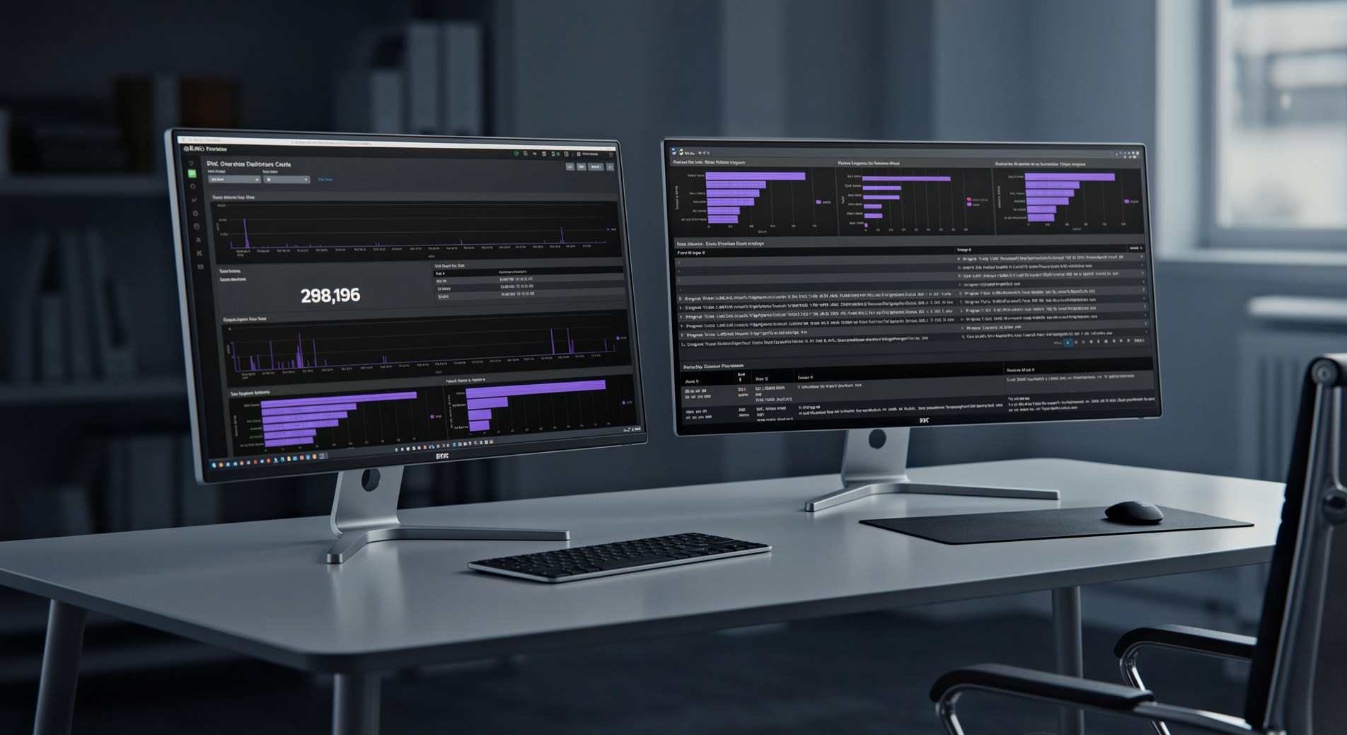
Through this article, I will build a SOC Overview Dashboard in Splunk that brings together authentication events, endpoint telemetry, network activity and threat hunting indicators into a single operational view.
My goal is to create something that resembles what a junior SOC analyst could realistically use at the beginning of a shift.
A dashboard should answer a few simple questions within seconds:
The dashboard acts as an operational starting point. It helps analysts identify anomalies before pivoting into detailed searches.
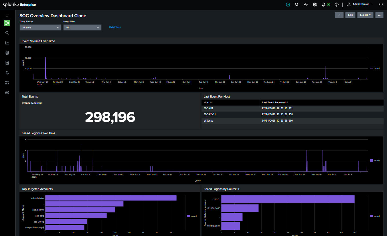
SOC Overview Dashboard
Before creating the panels, I identified the questions I wanted the dashboard to answer: I focused on the information a Tier 1 SOC analyst would typically review at the beginning of a shift. Each panel was designed to support a specific monitoring objective or investigation workflow.
The dashboard contains six major sections:
Each of them answers a specific operational question (listed before).
I also intentionally limited the number of panels. Rather than filling the dashboard with dozens of visualisations, I focused on panels that provide useful information and naturally support investigations.
Most dashboard searches begin with the normalize_soc macro.
Rather than repeating the same field transformations in every search, the macro standardises hostnames, account names and other fields before the query runs. This keeps each search shorter, easier to read and ensures every panel works with consistent data.
The complete macro definition is shown later in this article.
The first thing an analyst should verify is whether telemetry can be trusted. If systems stop sending logs, every other panel becomes unreliable. Before trusting any detection or investigation, analysts need confidence that telemetry is being collected consistently. For this reason, the dashboard starts with several health checks. These include:
index=*
`normalize_soc`
| search host=$host_filter$
| stats count as "Events Received"
index=*
`normalize_soc`
| search host=$host_filter$
| stats latest(_time) as LastSeen by host
| convert ctime(LastSeen)
| rename host as Host LastSeen as "Last Event Received"
index=*
`normalize_soc`
| search host=$host_filter$
| timechart span=15m count
These panels immediately reveal logging failures, disconnected forwarders or sudden drops in telemetry.
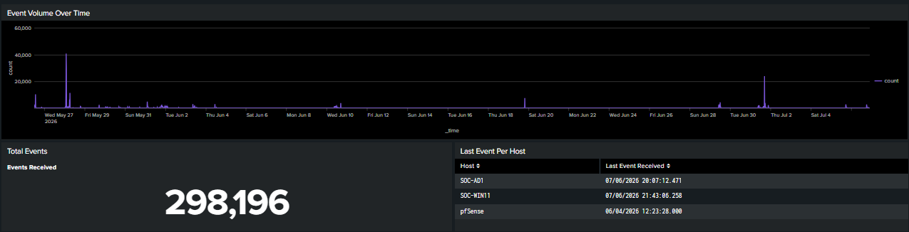
Section 1: SOC Health
Authentication events often provide the earliest indicators of malicious activity. This section focuses on Windows Security events such as successful logons, failed logons and account targeting. The dashboard includes:
index=* EventCode=4625
`normalize_soc`
| search host=$host_filter$
| timechart span=15m count
index=* EventCode=4625
`normalize_soc`
| search host=$host_filter$
| stats count by Account_Name
| sort -count
| head 10
index=* EventCode=4625
`normalize_soc`
| search host=$host_filter$
| stats count by Source_Network_Address
| sort -count
A sudden increase in failed authentication attempts against a single account may indicate password spraying, brute-force activity or a misconfigured service account.
Rather than manually searching for Event ID 4625 every time, the dashboard immediately highlights abnormal authentication activity.
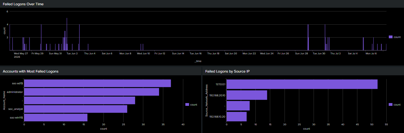
Section 2: Authentication Monitoring
In Active Directory environments, Kerberos authentication generates valuable telemetry that helps analysts understand how users authenticate to services. Monitoring ticket activity establishes a baseline for normal behaviour and may reveal unusual authentication patterns that deserve investigation. The dashboard includes:
index=* (EventCode=4768 OR EventCode=4769 OR EventCode=4771)
`normalize_soc`
| search host=$host_filter$
| timechart span=15m count by EventCode
index=* (EventCode=4768 OR EventCode=4769)
`normalize_soc`
| search host=$host_filter$
| stats count by Account_Name
| sort -count
| head 10
index=* EventCode=4769
`normalize_soc`
| search host=$host_filter$
| stats count by Service_Name
| sort -count
index=* EventCode=5140
`normalize_soc`
| stats count by Share_Name Account_Name
| sort -count
Together, these panels provide a quick overview of authentication activity across the domain and help identify unusual ticket requests or authentication failures.
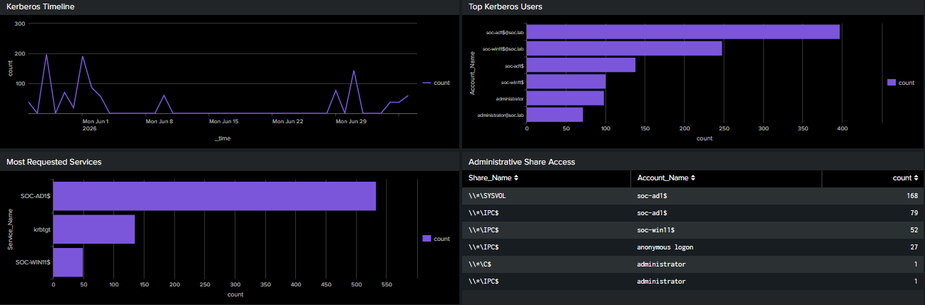
Section 3: Kerberos Activity
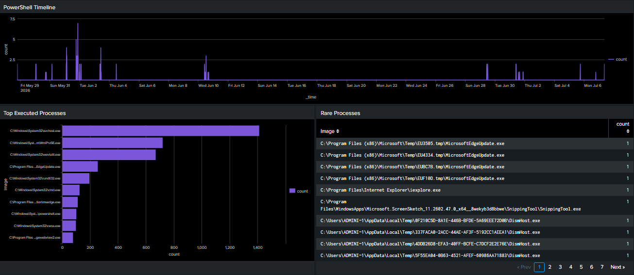
Sysmon provides detailed visibility into endpoint behaviour. For this section, I focused on process creation activity because it is one of the most valuable sources during investigations. The dashboard includes:
index=* EventCode=1 Image="*powershell.exe"
`normalize_soc`
| search host=$host_filter$
| timechart span=15m count
index=* EventCode=1
`normalize_soc`
| search host=$host_filter$
| top limit=10 Image
index=* EventCode=1
`normalize_soc`
| search host=$host_filter$
| stats count by Image
| where count<3
| sort count
Although PowerShell is widely used for legitimate administration, it is also one of the most common tools abused by attackers. Monitoring its execution helps identify unusual behaviour that may warrant further investigation.
Displaying PowerShell activity separately allows analysts to quickly recognise unexpected spikes before examining the underlying commands.
Section 4: Endpoint Activity
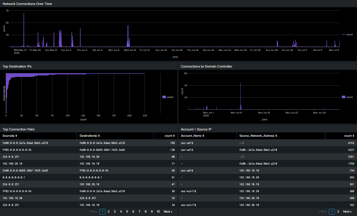
Network telemetry provides another perspective on endpoint behaviour. Using Sysmon network connection events together with pfSense logs, the dashboard summarises:
index=* EventCode=3
`normalize_soc`
| timechart span=15m count
index=* EventCode=3
`normalize_soc`
| search host=$host_filter$
| stats count by DestinationIp
| sort -count
index=* EventCode=3 DestinationIp=192.168.10.10
`normalize_soc`
| search host=$host_filter$
| timechart span=15m count
index=* EventCode=3
`normalize_soc`
| search host=$host_filter$
| stats count by SourceIp DestinationIp
| sort -count
index=* EventCode=4624 Logon_Type=3
`normalize_soc`
| search host=$host_filter$
| stats count by Account_Name Source_Network_Address
| sort -count
These visualisations help identify unusual communication patterns, reconnaissance activity and unexpected workstation connections.
Section 5: Network Activity
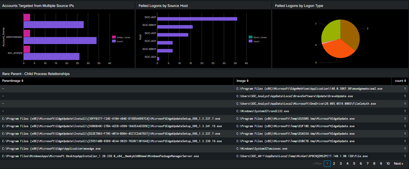
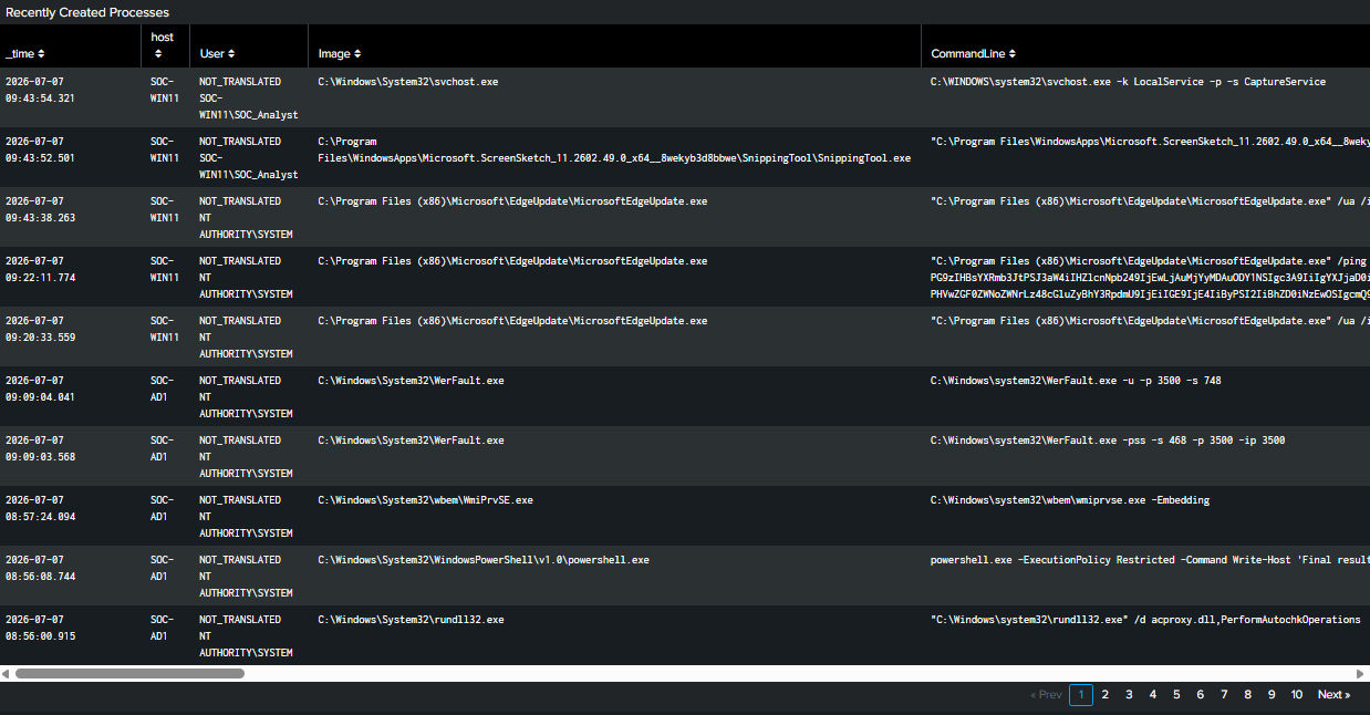
Rather than limiting the dashboard to monitoring, I also wanted several panels that encourage proactive investigation. These include:
index=* EventCode=4625
`normalize_soc`
| search host=$host_filter$
| stats dc(Source_Network_Address) as UniqueSources count by Account_Name
| where UniqueSources>2
| sort -UniqueSources
index=* EventCode=4625
`normalize_soc`
| search host=$host_filter$
| stats count by host Source_Network_Address
| sort -count
index=*
EventCode=4625
`normalize_soc`
| search host=$host_filter$
| stats count by Logon_Type
index=* EventCode=1
`normalize_soc`
| search host=$host_filter$
| stats count by ParentImage Image
| where count<3
| sort count
index=* EventCode=1
`normalize_soc`
| search host=$host_filter$
| sort -_time
| table _time host User Image CommandLine
These panels surface behaviours that deserve analyst attention. Even in a small lab environment, they demonstrate the thought process behind threat hunting rather than simply counting events.
Section 6: Threat Hunting
While building the dashboard, I discovered several inconsistencies that affected the results.
For example:
Although these represented the same systems or accounts, Splunk treated them as separate values. Rather than fixing every dashboard panel individually, I created a reusable search macro that normalises the data before visualisation.
The macro performs tasks such as:
This approach keeps dashboard searches cleaner while ensuring every panel reports consistent results. Data normalisation may seem like a small detail, but accurate visualisations depend on accurate data.
| eval Account_Name=lower(trim(Account_Name))
| eval Source_Name=trim(Source_Name)
| eval Service_Name=trim(Service_Name)
| eval host=trim(host)
| eval host=case(
    host=="192.168.10.1","pfSense",
    host=="WIN-PNR2BHPBOGS","SOC-AD1",
    true(),host)
| eval Source_Name=case(
    Source_Name=="WIN-PNR2BHPBOGS$","SOC-AD1$",
    true(),Source_Name)
| eval Account_Name=case(
    Account_Name=="win-pnr2bhpbogs$","soc-ad1$",
    Account_Name=="win-pnr2bhpbogs$@soc.lab","soc-ad1$@soc.lab",
    true(),Account_Name)
| eval Service_Name=case(
    Service_Name=="WIN-PNR2BHPBOGS$","SOC-AD1$",
    true(),Service_Name)
To make the dashboard more useful during investigations, I added several interactive controls.
The dashboard includes:
Selecting a specific host automatically updates every panel, allowing investigations to focus on a single endpoint without rewriting searches.
I also configured drilldowns for several visualisations.
For example:
These interactions mirror how analysts pivot between dashboards and raw events during investigations.
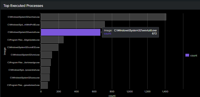
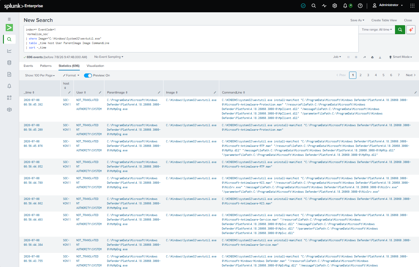
Drilldown example where selecting the wevtutil.exe value sends us to a customized, filtered, detailed search, where we can continue our investigation.
Building this dashboard changed how I interact with my homelab. Now, at the beginning of every investigation I have a central operational view that immediately answers the most important questions:
More importantly, building this dashboard forced me to think more like a SOC analyst responsible for monitoring an environment.
A detection-engineering exercise using Sigma, Splunk, Windows telemetry, and Atomic Red Team to validate vendor-neutral detection logic
How to Validate PowerShell Detections in Splunk with Sysmon, Atomic Red Team, and MITRE ATT&CK
Correlating failed logons, Kerberos authentication events, SMB access, and blocked lateral movement attempts in a hardened Active Directory environment